Employment Policies Cannot Solve Poverty

Employment policies, broadly defined here as policies that aim to achieve the maximum amount of employment and/or achieve a living wage for employed individuals, are central tenets of both political parties.  While the exact policies advocated for differ between the parties, these policies are seen to serve two primary objectives:
1. Bolstering the middle class (either through increasing its size from the bottom up or increasing its income).
2. Helping the poor and alleviating poverty by providing the poor with either more income or more employment opportunities.
These policies may be effective at achieving the first objective. Surely, the supposed effect on the middle class is the motivating political force behind these types of policies. However, given the types of individuals who find themselves in poverty, I believe that these employment policies play an out-sized role in our political discourse, especially when they are presented as a means to combat poverty.

To fully understand my position requires letting go of many prejudices about the “undeserving” poor.  We are often told that the reason most people lack an adequate income is due to a “culture of poverty” which pervades in low income areas, or to a moral or academic failing of the individual impoverished person – therefore, they are “undeserving” of assistance.  Overcoming this culture, this logic says, requires much work and an abundance of jobs; we should instill discipline in impoverished children through the harsh tactics practiced in many charter schools and ask low wage workers to work longer hours. After this discipline is achieved, it is vital to make sure that there are enough jobs available, and that they pay a living wage. One strategy, popular in the Republican party, is to bless job creators with tax cuts so that they have the means to provide more jobs. Other strategies, more commonly attributed to the Democratic party, are increases in job training and increases in the minimum wage.

While these measures may be well intentioned, they surely cannot solve, or even come close to solving, the problem of poverty in America.  This is due to one simple fact that the “culture of poverty” types do not like to disseminate – the vast majority of the poor in America are not allowed to hold full time employment (children and students) or are not capable of holding employment (elderly, disabled, and their caretakers).  This can be seen quite easily in the two charts below, created by Matt Bruenig at Demos.  To create these charts, Matt uses census level data to break down the percentage of the poor population made up of children, elderly, disabled, students 18+, caretakers of disabled relatives, unemployed, employed, and “other” which are members of a poor household that are not in the labor force. These charts represent the “official poverty metric”, which takes into government transfer payments like social security, but not does not take into account food security programs like SNAP or the Earned Income Tax Credit.


If a culture of poverty truly inflicted the majority of these individuals, you would be hard pressed to find evidence in this chart.  For example, if poor people were truly lazy, the vast majority of them should lie in the “other” category, meaning that they would be able bodied, working age, not employed, and not looking for a job.  However, only 7.6% of poor individuals fall into the “other” category.  It should also be noted that “other” does not only include the lazy, but also, for example, poor stay at home parents whose partner is in the workforce but cannot afford child care.

Reading this chart also makes clear that employment policies would do very little to alleviate poverty. Even if we could reduce the unemployment rate to 0% among the poor (we couldn’t), many of these formerly unemployed individuals would remain in poverty if they received a wage at or near the minimum.  Furthermore, even if they all somehow escaped poverty (maybe there was an increase in the minimum wage), and all of the fully employed escaped poverty, 75% of poverty would still remain (this excludes all children that these people have, but even if all of these children were lifted out of poverty, 45% of poverty would still remain).

If we, as a country, believe that it is important to alleviate poverty, we cannot simply settle for employment policies.  We must demand that our politicians create programs that directly affect, but are not limited to, those experiencing poverty.  Personally, I support universal policies because their universal nature fosters political support; sadly, it is easier for many people to see the wisdom in cash grants if they receive one as well. Examples of such policies are a $300 per child per month cash grant for every child (not just the poor ones), free universal child care, or a universal basic income for all residents.

Predicting NBA2K Ratings

The other day, when I was searching for this year’s NBA 2K ratings, I saw this article by Adam Yudelman at Nylon Calculus, a basketball analytics blog.  He was using player level statistics from the previous year to forecast player ratings in the game the following year (for example, using 2012-2013 stats to forecast 2K14 ratings).  After clicking over to the technical details of his forecasting model, I noticed a couple of things: he was using a huge amount of player level data, and he was running an unrestricted regression (simple OLS) to implement his forecasts.  However, there is considerable uncertainty about what variables are useful in predicting future ratings, since we don’t know what stats the developers look at when deciding on ratings. For example, when deciding on ratings, the developers at 2K sports might look at points per game (PPG), points per 36 minutes (PP36), points per 100 possessions (PP100), or maybe even all three. Due to the inherent model uncertainty, I thought that I might be able to improve on Adam’s forecasts using a technique called Bayesian Model Averaging (BMA), which I have used in my economics research.

The idea underlying BMA is relatively simple.  Since we don’t know which variables belong in the model, we should average the results from a number of models, each of which contains a subset of the variables.  In practice, we use a weighted average of these models, where models that fit the data better receive higher weight.  The weight of each model is determined by the model’s marginal likelihood (similar to the AIC or BIC in a traditional OLS framework).

To see why BMA can improve out of sample forecasting, consider the following example.  Assume that the developers only look at PPG; that is, they don’t take PP36 or PP100 into consideration when deciding on ratings, but that the person trying to predict the ratings didn’t know that.  This person ran OLS with all three variables included.  Likely, the coefficients on PP36 and PP100 would be close to zero, but different than zero. Now imagine this person adding dozens of similar variables to the regression, none of which the developers actually pay attention to.  Now, they would have dozens of coefficients near zero, but because there were so many of them, they could potentially add a substantial amount of “noise” to forecasts.

BMA deals with this problem by probabilistically weighting the models.  The model including all of the variables may not fit any better than the model that only uses PPG.  Since, in a Bayesian framework, there is a built in penalty for including more variables, the model with only PPG would receive much higher weight than the full model.  When you average across the two, the coefficients on all the other variables would get further weighted towards zero (since they are not included at all in the PPG only model, more than half of the weighted average would be 0).  Therefore the “noise” that results from including all of the extra variables in OLS is dampened when using BMA.

When I implemented BMA for 2K ratings, I did so using three sets of variables.  First, I used the same variables that Adam did – I call this model BMA.  Next, I used all of the variables that Adam had collected – I call this model BMA Full.  Finally, I used all of the variables collected, along with the previous year’s 2K rating – I call this model BMA Full Lag.  The number of variables is large in all three models: 27 in the first, 55 in the second, and 56 in the third.

Results

Model RMSFE MAFE
BMA 4.47 3.54
OLS 4.68 3.75
Model RMSFE MAFE
BMA Full 4.37 3.48
OLS Full 4.62 3.65
Model RMSFE MAFE
BMA Full with Lag 3.41 2.55
OLS Full with Lag 3.71 2.78

I found that performing BMA with the same variables that Adam included increased forecasting accuracy by about 5%, reducing the RMSFE (you can think of this as the standard deviation of the actual values minus predicted values) from 4.68 to 4.47, and the MAFE from 3.75 to 3.54.  While the forecasting gain is real, it is quantitatively small.  In the BMA Full model, I found similarly sized gains, with the RMSFE falling to 4.37 from 4.62 when BMA was used instead of OLS.  Finally, including the previous year’s 2K rating improved the performance of both models.  The RMSFE fell to 3.71 when using OLS, and fell further to 3.41 when BMA was used. There are two graphical illustrations below.

BMA_full_lag_scatter

Batum_rating_histogram

The top image is a scatter plot of the forecasted ratings vs. the actual ratings.  If we predicted with perfect accuracy, all of the points would lie on the 45 degree line.  We can see that forecasting accuracy improves when using the model that includes a lag, since on average more of the points lie closer to the 45 degree line.

The bottom image contains the posterior rating distributions from all three BMA models for Nicolas Batum’s 2K15 rating.  In his case, there were improvements as we moved from BMA to Full BMA to Full BMA with Lag. Under the BMA model, the posterior forecast is wide, and centered around 81 (his actual rating, as indicated by the black bar, was 79).  In the Full BMA model, we can see that the mean of the distribution has shifted to the left, and the peak lies on top of his actual rating.  However, in the Full BMA model the forecast interval is still fairly wide, with a 95% credible interval of about 71-87.  In the Full BMA with Lag model, the distribution is still centered around his true rating, and credible interval shrinks to 74-84, indicating that we are now estimating his rating more precisely.

Conclusion

I showed off the power of BMA in the context of forecasting NBA 2K ratings. Specifically, I showed that when there is uncertainty about the variables to include in a regression model, taking a weighted average across all possible models can help improve out of sample forecasting accuracy. Although the application topic is fun, the general result remains true in more serious applications as well, such as when finding correlates of economic growth or when forecasting recessions.

Finally, I would like to thank Adam Yudelman again for sharing his data with me.

A Liquidity Trap in an AS/AD Framework (Part III of IV)

It’s been a while. In my previous two posts on this topic, we saw first how the AS/AD worked, and then how it was modified to include the possibility of the zero lower bound (ZLB). Recall that the ZLB means that central banks cannot reduce the nominal interest rate below 0%.

Recall that the AS curve is given as:

AS: \pi_t = \pi_{t-1} + \bar{v}\tilde{Y}_t + \bar{o}

Back in November, we saw the following result for the AD curve:
AD: \tilde{Y}_t = \bar{a} - \bar{b} \bar{m} (\pi_t - \bar{\pi})  if  \pi_t \ge \frac{\bar{m}\bar{\pi}-\bar{r}}{1+\bar{m}}

\tilde{Y}_t = \bar{a} + \bar{b} \bar{r} + \bar{b} \pi_t  otherwise.

Plotting the AS and AD equations, we have:

adas_diagram

Now, let’s see what would happen in the AS/AD model if we had a small negative demand shock, and we had started at the equilibrium depicted above:

adjustment_after_negative_125_demand_shock-2

We see that since the AD curve has shifted left, it causes disinflation.  Since inflation has fallen, the intercept of the AS curve, which includes  \pi_{t-1} , is now smaller.  In other words, the AS curve shifts down.  The downward shift of the AS curve causes another decrease in inflation, and this process will repeat until the output gap is closed (i.e. output returns to potential, at the point short-run output = 0% in the above graph).  We can see that the the economy above is self stabilizing for small demand shocks – that is, a small demand shock does not cause any explosive behavior, such as sending inflation to infinity or to negative 100%.

But what would happen if a bigger demand shock hit?  If the shock is large enough so that the kink in the AD curve falls to the left of 0%, and if this shock is long lasting, it will eventually result in a deflationary spiral:

adjustment_after_-225_demand_shock_-_deflationary_spiral

From the graph, it’s easy to see that the output gap can never be closed, it will always be negative, no matter how the AS curve shifts.  Due to the zero lower bound, the Fed cannot stabilize the economy, and the economy explodes towards both an output gap and inflation of -100%. In other words, the economy continuing shrinking until there is 100% unemployment, and no currency.  This is obviously an extreme scenario; we are basically pushing this model to its breaking point.  However, it illustrates how deflation and the zero lower bound can cause severe economic problems in real life, such as prolonged depressions or secular stagnation.

What happens when the shock ends? Will the deflationary spiral end?  How could we avoid this episode in the first place? I’ll try to answer these questions, at least in this simple model, in my next post.

Race is Real

Edit: What I really mean by my title is, “the effects of race are real”.  Race, of course, is a social construct.

I’ve been sitting on this post for a while, and couldn’t decide whether or not to publish it. I started this blog as a professional tool, a way to jot my thoughts down about macroeconomics and issues like inflation, liquidity traps, Federal Reserve policy, etc.  But as long as I have a single reader out there, I feel like I have a responsibility to talk about the issue of economic inequality between blacks and whites – it is real, it is persistent, and it is extremely troublesome.

Imagine you were born with black skin sometime before 1986. Big deal, right?  In 2011, if you were actively looking for a job, here is the unemployment rate you can expect, compared to your white neighbor, for every level of education:

white_black

So, your white neighbor who dropped out of high school would have the same chance of finding a job as you, a student who had earned an associate degree.

Okay, you might say, but that is in 2011, in the aftermath of a recession. Maybe things are different in “normal” times. Not exactly:

Screen Shot 2014-09-26 at 12.48.16 AM

The black unemployment rate is consistently about twice as high as the white unemployment rate.  Remember the Great Recession, when white Americans collectively lost their minds, and started both the Tea Party and Occupy Wall Street out of a sense of despair and inequity?  Well, the white unemployment rate, topping out at about 8%, was lower than the black unemployment rate at almost every point over the previous 40 years.

Yet we supposedly live in a country where race no longer matters, and blacks are the “real racists” (if you don’t believe that people hold these views, I urge you to read the comment section of any article about Ferguson, or essays on race published in a conservative magazine like the National Review).

The previous two graphs represent a snapshot in time, and we can easily see that blacks have a much harder time finding employment than whites.  But what is the accumulated effect of this over time?

fig-3-2

Blacks have virtually no wealth.  Most of this is due to the fact that homes in predominately black neighborhoods are not worth as much as those in white neighborhoods, so blacks cannot build equity as easily as whites. This massive wealth disparity remains when controlling for income levels, which I will leave as an exercise to the concerned reader to look up for themselves. Unsurprisingly, it also remains when controlling for education levels:

Median

Again, even when blacks go to college, their household wealth remains lower than white dropouts.  Part of this is because going to college does not guarantee blacks a job like it guarantees whites a job.  Another large part is because when a large number of blacks move into neighborhoods, home prices plummet, so trying to build equity through home ownership just doesn’t work for blacks like it works for whites.

So, assuming you care, what can you do about this? If you own a business, and have two equally qualified applicants, I would urge you to hire the minority candidate. This might mean choosing that candidate over a family friend, or another individual who has connections to you or to others in your company. So be it. The white applicant will more easily find a job elsewhere.

As for everyone else out there, I’m afraid the answer isn’t so easy. But we at least need to start talking about it. If you are interested in learning more, I would highly suggest reading Being Black, Living in the Red.

——
Sources:
First graph: http://www.dol.gov/_sec/media/reports/blacklaborforce/
Second: http://www.theatlantic.com/business/archive/2013/11/the-workforce-is-even-more-divided-by-race-than-you-think/281175/
Third & Fourth: unfortunately, I lost the link, but there are several similar graphs available at demos.org. A graph adjusted for income can be found here: http://www.demos.org/data-byte/whites-have-more-wealth-blacks-and-hispanics-similar-incomes

A LIQUIDITY TRAP IN AN AS/AD FRAMEWORK (PART II)

Welcome back. Last time we saw three important curves:

IS: \tilde{Y}_t = \bar{a} - \bar{b}(R_t - \bar{r})
MP: R_t = \bar{r} + \bar{m} (\pi_t-\bar{\pi})
AS: \pi_t = \pi_{t-1} + \bar{v}\tilde{Y}_t + \bar{o}

However, this MP curve is misspecified.  In order to fix it, we need to consider two additional relationships:
ZLB: i_t \ge 0
Fisher: i_t = R_t + \pi_t

The first equation, the Zero Lower Bound (ZLB), says that nominal interest rates cannot go below zero. This relationship holds in real life, because if banks charged a negative interest rate people would not put their money in the bank. Instead, they would just hold cash in their house, or buy nonperishable goods that they expected to keep their value, like gold.

The second equation, the Fisher equation says that the nominal interest rate, i_t 
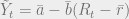
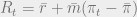
is equal to the sum of the real interest rate and inflation. If we substitute this equation into the first, we have:
R_t + \pi_t \ge 0 \\ R_t \ge - \pi_t.
In words, the central bank cannot ever lower the real interest rate below the negative rate of inflation. Again, this is because the nominal interest rate can’t go below zero.

Therefore we see that the central bank must use a piecewise function to conduct monetary policy:
MP: R_t = \bar{r} + \bar{m}(\pi_t-\bar{\pi})  if  \bar{r} + \bar{m}(\pi_t-\bar{\pi}) \ge -\pi_t
R_t = -\pi_t   otherwise.

Plugging the MP curve into the IS curve will give us the new AD curve, which will also be a piecewise function:
AD: \tilde{Y}_t = \bar{a} - \bar{b} \bar{m} (\pi_t - \bar{\pi})  if  \pi_t \ge \frac{\bar{m}\bar{\pi}-\bar{r}}{1+\bar{m}}
\tilde{Y}_t = \bar{a} + \bar{b} \bar{r} + \bar{b} \pi_t  otherwise.

This is a remarkable result! If inflation falls low enough, so that the policy rule gets stuck at the lower bound, then the slope of the AD curve switches sign, and turns positive. Looking at this result graphically, we have:

adas_diagramNext time I will show how demand shocks (changes in \bar{a}) will shift the AD curve.  First, I will do a simple example using the AD curve without the ZLB to show what happens during “normal” recessions.  Next, I will re-introduce the AD curve I just derived, and show that if the reduction in demand is large enough, the economy can get stuck in a deflationary spiral.

Inflation in the US has not been a monetary phenomenon since 1992

Apologies for the long title. It’s a reference to one of the most famous quote in economics, which is due to Milton Friedman in 1970:

“Inflation is always and everywhere a monetary phenomenon in the sense that it is and can be produced only by a more rapid increase in the quantity of money than in output.”

Now, I’m not a blind Friedman hater. In fact when it comes to monetary policy, I tend to agree with him.  The statement above was grounded in fact for most of history, especially during very severe episodes of hyperinflation.  However, it has not accurately described the experience in the U.S. since at least 1992, and this fact is presented as a puzzle in the textbook I use for my money and banking class.

The statement above is grounded in a theory called the quantity theory of money. I’m going to skip specifics, but here’s the gist. There is an equation that must hold at all time periods, it is a simple accounting identity. That equation is:

MV = PY

where M stands for the money supply, V stands for the velocity of the money supply (i.e. how many times a given dollar bill changes hands throughout the course of a given period of time), P stands for the price level, and Y stands for real output (i.e. real GDP).  Finally, note that a change in the price level is what we call inflation. In other words, if P increases, then there has been inflation.

The quantity theory is a theory about the long run, so it makes a sensible assumption: over long periods of time, the velocity of money should not change very much. In fact, it should be constant. Imposing this assumption, and using some algebra, it can be shown that to a first approximation, the equation above can be written the following way:
p = m – y
Where the lowercase letters represent percent change in each of the variables above.  So, p is the inflation rate, m is the growth rate of the money supply, and y is the growth rate of real GDP.

So, if Milton Friedman, and the quantity theory, are correct, then over long periods of time and after adjusting for growth in real output, the rate of inflation should equal the growth rate of money.  Inflation should be a monetary phenomenon.  But look at the following chart:

M_Y_PI

Here, I have taken the 10-year moving average of inflation (measured by CPI) and the output-adjusted growth rate of the money supply (measured by M2).  We can see that the quantity theory describes things very well until 1975, and then continues to do a decent job until about 1992.  At that point, inflation levels off, while the growth rate of money plummets.  More recently, the growth rate of money rises substantially, but inflation has remained steady.

Here’s another way of looking at the same thing:

M_Y_PI_Scatter

This is a scatterplot of the same two variables, with a line of best fit going through the period 1969-1991. According to the quantity theory, this line should line up on the 45 degree line, i.e. it should go through the points (x,y) = (.03,.03), (.04,.04), (.05,.05), etc.  It is a little bit too steep, but the relationship is close, and quite obvious just from eyeballing the chart.

However, for the period 1992-2014, it’s not even close.  I didn’t plot the line of best fit, but due to the bottom right most blob of red points, the slope is actually negative! The quantity theory is an abysmal failure at describing the last 20 years of economic experience.

I believe that the simplest and most likely explanation for this phenomenon is that it is an example of Goodhart’s law in action, combined with improvements in policy making at the Federal Reserve.  That is, one of two things happened at the Fed in 1992: first, they either started trying to hit an inflation target for the first time; second, they had always had an inflation target, but for the first time reacted to the non-monetary causes of inflation – changes in consumer behavior (and therefore velocity).  In either case, the improvements in policy at the Fed triggered Goodhart’s law, in which case we would expect to see the red dots and not the blue dots in the second chart.

To see why, note that if the Fed thought that inflation was going to fall below their target (or that velocity was going to fall), they should increase the growth rate of the money supply.  If they do a good job, and increase the growth rate of the money supply by exactly the right amount, then inflation will remain unchanged.  In contrast, if they believed that the inflation rate was going to rise above the target, then they should decrease the growth rate of the money supply.  Again, if they do this by the right amount, then inflation will remain unchanged.  If the Fed is doing a god job at hitting its inflation target, what we would expect to see are fluctuations in the growth rate of the money supply, but a steady rate of inflation.  Looking at the first chart, that is exactly what we have seen over the past 20+ years.

A final note, in theory, the Fed doesn’t really care what the money supply is; instead, they target short term interest rates, and let the money supply be whatever it needs to be in order to hit that interest rate target.  However, that target is determined (in part) by what the inflation rate is, so in practice it’s fine to theorize as if the Fed is directly manipulating the money supply to hit an inflation target.

Putting Seattle’s New Minimum Wage into Perspective

Recently, Seattle passed a new minimum wage bill that will increase the minimum wage to $15.00 for all employees by 2021 (some will receive that wage earlier).  Much of the commentary around minimum wages often cites the inflation adjusted federal minimum wage of $10.98 in 1968 as the highest federally mandated minimum wage in the nation’s history.  This got me thinking about what policymakers should take into account when deciding on a minimum wage.  In my opinion, it depends on what they view the purpose of the minimum wage to be, and a large number of policymakers may want to consider adjusting the minimum wage for both inflation and productivity increases.

The first view of the minimum wage is that it should be a basic living standard for someone who is fully employed.  Under this view, a policymaker might want to index the minimum wage only for inflation – that is, to make sure that the minimum wage will provide the same living standard throughout time.

The second view of the minimum wage is that in addition to providing a base living standard, it also serves to equalize the bargaining power of employees and their employers.  Under this view, the minimum wage should not only increase with inflation, but it should also rise as workers become more productive.  Therefore, a policymaker should index the minimum wage to nominal per capita GDP – this would ensure that someone earning the minimum wage earns the same fraction of per capita GDP throughout time.

With these two views in mind, let’s take a look at history. If we only adjust for inflation, the peak value of the federal minimum wage occurred in 1968, when a worker earned the equivalent of $10.98 per hour today.  By this perspective, the $15.00 per hour minimum wage in Seattle looks historically high:

 Screen Shot 2014-08-10 at 8.06.32 PM

If we also adjust for productivity, then the picture changes.  A simple way to adjust for both productivity and inflation is to index the minimum wage to the level of nominal per capita GDP.  Nominal per capita GDP increases for two reasons.  First is inflation, which increases prices, and therefore the dollar value of GDP.  The other reason is due to increased productivity, that is, as technology improves and each worker can produce more, we produce more goods and services.

Taking this second view, the minimum wage peaked at $20.48 in 1956, and didn’t fall below $15.00 per hour until 1971.  This view would support the view that Seattle’s new minimum wage is in line with historical norms, and is not extravagantly high. 

Screen Shot 2014-08-10 at 8.07.29 PM

In either case, we will have evidence in a few years on the impact of Seattle’s law.  

Two final notes. First, by the time Seattle’s minimum wage law takes full effect in 2021, the real purchasing power of the minimum wage will most likely be about $13.00, due to inflation between now and 2021.  Second, after I had thought about this for a while and written most of this post, I discovered a column that makes a similar argument to mine, and goes into a little more detail.  It can be found here.